A pickleball paddle can be a piece of personal style as well as sporting equipment. Some players enjoy bright graphics, while others prefer a restrained surface or a familiar carbon-fiber look. There is no single appearance that every player should find attractive.
This article considers paddle design from an aesthetic perspective. Color, typography and composition can be enjoyable parts of choosing gear without establishing spin, control or durability.
This design-focused guide offers a way to compare color, typography, composition and coordinated details. The judgments are matters of taste, not measured performance rankings or a claim that a particular brand looks best.
Key Takeaways
- Personal preference: Bold graphics, minimal layouts and retro patterns can all work when they suit the player’s taste.
- Expression: Choose a look you enjoy without assuming it will improve confidence, control or match results.
- Design options: Compare minimalist layouts, geometric patterns, illustration and color blocking rather than treating a brand name as a design score.
- Details Matter: Great pickleball paddle design goes beyond the face graphic, involving cohesive elements like the edge guard, grip quality, material finish, and overall form.
The Problem with Pickleball Paddle Design
A design that feels busy to one player may be appealing to another. When comparing paddles, look at the balance between graphics, lettering and empty space. Ask whether the main image remains readable and whether the color combinations are ones you want to carry.
You can consider appearance alongside grip comfort, shape and intended use. If the attractive option does not fit your hand or your competition requirements, keep looking rather than assuming that style requires a performance compromise.
Why Does Good Design in Sports Even Matter?
Appearance can be one reason you enjoy owning an object, just as color and graphics can matter in other sports equipment. That preference does not establish a psychological benefit or a better result on court.
A paddle that reflects your taste may feel more personal and can start a conversation. It does not guarantee confidence or better match results.
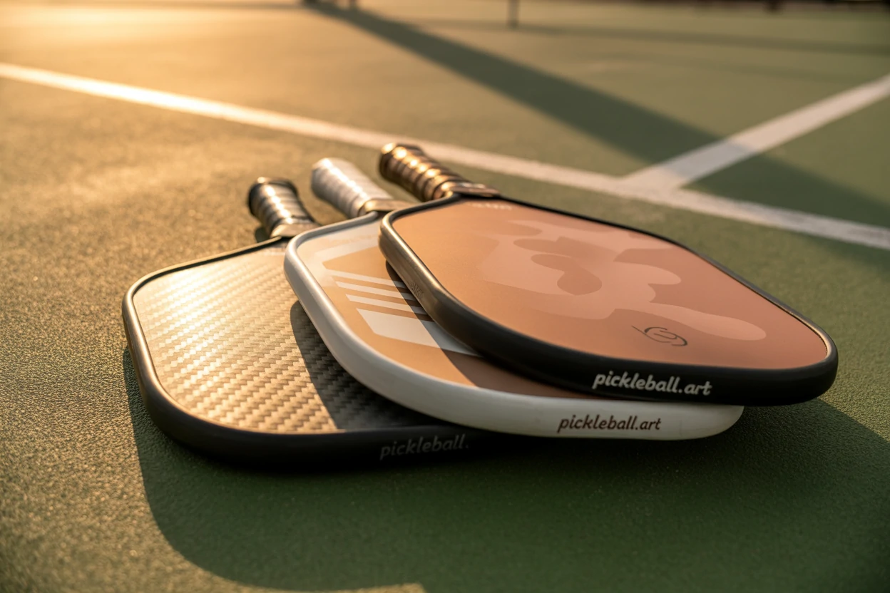
Compare the whole paddle rather than only a face graphic. The handle, edge guard, finish and shape can make a design feel cohesive. Choose those details by your preference and assess their functional condition separately.
Compare Design Choices by Your Own Taste
The examples below offer a vocabulary for describing visual choices. A neon palette, a large logo or a retro font is not a defect by itself; its appeal depends on the overall composition and your taste.
| The Ugly: Common Design Crimes | The Beautiful: Hallmarks of Excellence |
|---|---|
| Generic Graphics: Stock-looking flames, lightning bolts, or abstract digital noise that feels impersonal and lazy. | Artistic Collaboration: Unique graphics and patterns created by real artists, giving the paddle a distinct personality. |
| Garish Neons: Color schemes that look like a highlighter exploded, clashing with most athletic wear. | Sophisticated Palettes: Thoughtful, harmonious color combinations, including minimalism, retro aesthetics, and color blocking. |
| Dated Fonts: Chunky, shadowed, or overly stylized text from a bygone design era. | Clean Typography: Modern, clean fonts with intentional placement that complements the overall design. |
| Distracting Patterns: Busy, chaotic designs that overwhelm the eye and detract from the paddle's shape. | Harmonious Composition: Graphics, patterns, and colors work together to create a unified, pleasing look. |
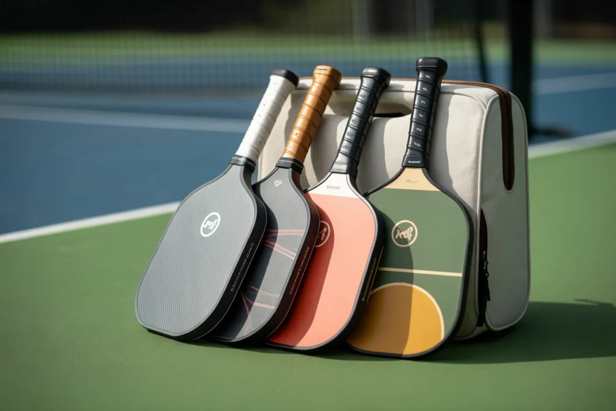
Look across several design approaches before choosing. A quiet layout and an illustrated surface may both be attractive for different reasons.
Design approaches to compare:
- Minimalist: A restrained palette, simple lettering and generous empty space can create a quiet, coordinated appearance.
- Retro-inspired: Repeated shapes, familiar color combinations and period-inspired typography can make a playful design.
- Illustrated: An image-led face can work like a small print, with the shape of the paddle forming its frame.
- Geometric: Repeated forms or color blocks can give a graphic design structure without relying on detailed illustration.
- Personalized: If a seller offers a custom option, review the proof and exact terms. Ask whether the resulting model and surface remain suitable for your event.
These are design categories, not rankings of current brands or verified claims about their product programs. Use them to explain what you like when comparing actual options.
What a Well-Designed Paddle Looks Like
So, what are the elements that separate the good from the bad and the ugly? From an aesthetic perspective, it comes down to a few key details that define superior pickleball paddle design.
- Shape and Form: The classic rectangular paddle shape is a great canvas, but the elongated shape can offer a sleeker, more modern silhouette. The key is for the graphics to complement the form, not fight it. A vertical design on an elongated paddle, for instance, can enhance its length and elegance.
- Edge guard: Compare how its color and profile work with the face. A slimmer look is a preference, not proof of better protection or construction.
- Grip and handle: Consider how the color fits the design, then check actual comfort and condition. A coordinated grip is not automatically a high-quality one.
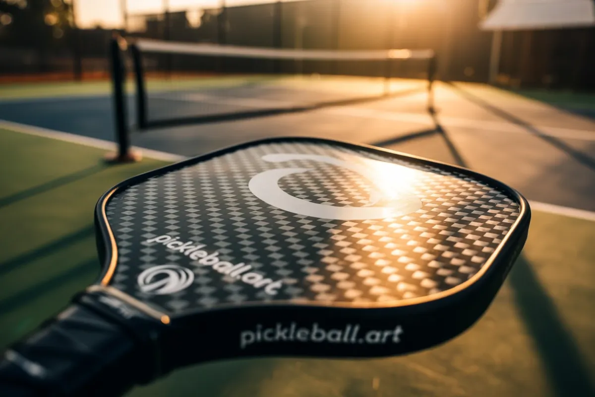
- Material and finish: A visible weave, solid color, matte surface or glossy finish can be part of the appearance. Judge the actual paddle rather than assuming a material name proves durability or that one finish always wears better.
- Cohesive Graphics: Great design is about harmony. The graphics, fonts, and colors should all work together to create a unified look. The logo placement should be intentional, not just slapped on as an afterthought.
Customization and Future Design Possibilities
Personalization, illustration and new color combinations are possible design directions. Check a seller’s actual current options rather than treating a predicted trend as an available product.
Artist collaborations and customization are possible design directions rather than guaranteed future releases. Check a seller’s current options and the approval implications of any surface change.
This isn’t a call for all paddles to become minimalist art pieces. The beauty of design is its diversity. The goal is to have options—bold, subtle, retro, modern, artistic, and everything in between. The goal is choice.
Make a Practical Design Shortlist
Save a few designs you enjoy and compare them at the same image scale. Check photographs of the handle and edge as well as the face. If color matters, remember that screen appearance may differ from the physical item.
Review the exact model’s shape, weight, grip, return terms and approval separately. If personalization is involved, check the proof, rights to the artwork and the effect of any surface change before ordering. The custom paddle buying guide covers those decisions.
Send your design preferences through the contact page. Compare graphics you enjoy while still checking the paddle’s fit and approval.
Frequently Asked Questions
Design can express your taste through color, typography and composition. A look you enjoy is a valid preference, but appearance alone does not establish confidence, playing ability or product performance.
Minimalist, retro-inspired, illustrated and geometric designs can all be appealing. Compare actual options by your taste and assess fit, condition and approval separately instead of assuming one brand is best.
A composition may feel too busy when its fonts, graphics and colors compete for attention. That is a subjective judgment: a bold or neon design may be exactly what another player enjoys.
Some sellers offer personalization, but availability and terms vary. Confirm the exact program, review an artwork proof and ask about the resulting model’s event eligibility before ordering.
Compare the shape, edge guard, grip color and surface finish for a cohesive appearance. Check comfort and construction separately; coordinated colors are not a quality test.
Before sanctioned competition, check the exact model on USA Pickleball’s approved paddle list. Graphic or surface modifications require a separate compliance check.